Showing posts with label Level Editing. Show all posts

Sunday, January 19, 2014

Testing and Internals

In addition to my ongoing testing, I've been working on some level design lately that is a little more challenging than previously - primarily because I'm working on an interior rather than an exterior.  I don't think it's a significant spoiler to say that the vast majority of The Shattered War will occur outdoors.  This is an adventure focused on the events of an area within the wilderness, and the natural landscapes, forests, hills, valleys, and the settlements built on these are where the bulk of the action will occur.

However, there are some times where the player will have to go indoors. For these areas, I've largely been taking existing areas from the campaign and making some modifications so that they're not immediately recognisable - but I'm hopeful that this will be to far better effect than was done in Dragon Age 2.  I'm definitely avoid repetition within my own adventure, but there are a couple of layouts that will likely seem very familiar to those who know the campaign intimately.

That said, I have been working on getting the structure down of some completely new areas largely created from scratch.  Here I've been using an existing levels as a base, but only as a starting point from which to add my own rooms - effectively stripping the original level down to very little before adding my own new rooms in.  This gets around some of the initial level creation issues, and also gives me a base of model names for room components and structure models to use for my own work.  I became quite familiar with model names for exteriors, so having to do interiors meant learning a whole new set of model names, which increases the amount of time taken by quite a bit.  Also critical in indoor levels is ensuring that everything is lined up. Exteriors are a bit easier to "eyeball it", when it comes to placement, but interiors really require that everything fits together nicely in order to work properly.
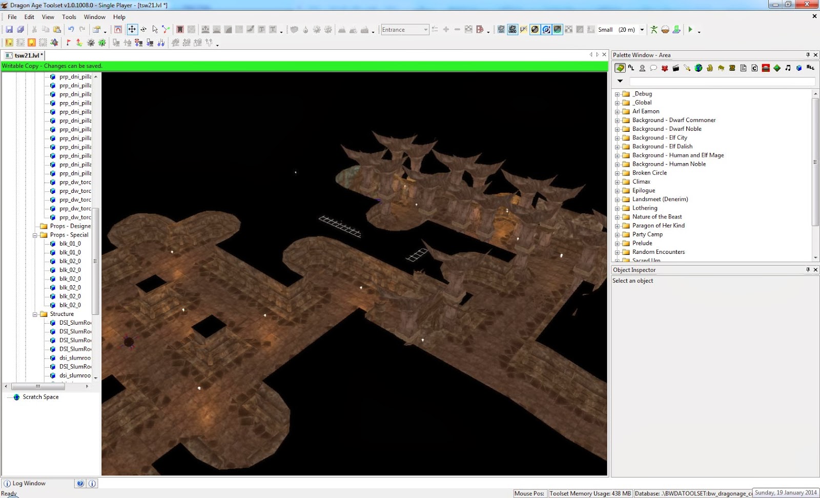
Working shot of part of an interior

This shot is one of the "easy" options - stone corridors are far easier to match up than caverns and cave interiors.  What's worse is that the models in Dragon Age really don't match up very nicely and often require you to match specific pieces with each other, making it harder to get a more unique look and design without copying the original Dragon Age levels. I want to ensure that the "special" locations in The Shattered War are exactly that - special - and not make the player think "wait, I've been here before." Hence the need for the effort required to create these unique interiors for the adventure. 

Sunday, November 3, 2013

Playtesting: Old and New

One of the big things from doing a bunch of playtesting is that you quickly realise where things don't quite work. This is blatantly obvious when it comes to show-stoppers, of course.  If you can't progress a quest because of some logic error, an area being inaccessible (either in or out) or not receiving an object you need to complete the quest, this is immediately recognisable.

With the title of this post, what I'm talking about is where things don't "fit" quite so well as they should.  While I've been focusing primarily on the big show stoppers, I also hit upon the continuity, realism or general flow of the game issues that mean things just don't come together nicely.  One such issue was relating to a major quest, where part of it occured on the same area as a main town map area.  This was originally to make sure the player got to see the whole town map area, but as I played the game, I realised that it simply didn't fit in terms of the content of the quest.

This means new area time!  Now, in this particular case, I didn't actually want to spent hours and hours on making a new area. This is basically a one-shot area that isn't really designed for much more than a single encounter. I've created almost all my areas from scratch in The Shattered War, but there are a couple where I have used existing work as a base for an area. In this case, I grabbed one of the default areas from DAO... but modified it to suit my own purposes.  Doing this, I've managed to create an entirely new area with basically only a few hours of effort. 

The really good thing about this is that with some clever editing, it's quite easy to change the area such that it's not easily recognisable as one of the original areas even for someone who has played the game a lot.  By removing a bunch of items, changing texturing and vegetation, and doing a few key modifications to the existing terrain, it is possible to make it look dramatically different. Here's a shot of my modified level below - if you've played DAO, see if you can spot where it came from!

You never know what's around the corner...

If you're interested, here's a link to a comparison shot of the original level compared to my modified version.  I'd still like to do a bit more work to the decoration of the level, but given my current focus is getting the mod "content complete", that will have to wait.

Wednesday, April 24, 2013

How long does it take to make a level?

Recently I was asked a question about level design and for some advice on how to construct a level. I was also asked about how long it takes to make a level.

As for general advice on how to construct a level, there are entire books on the subject. Achieving a level that is successful both functionally and aesthetically is a challenging task, and the former will depend greatly upon the style of game that is being created. A level for a multiplayer FPS will be vastly different to a story driven FPS, which will be different again to a single player RPG, which will in turn be different from an open world MMO. Simply put, there is no silver bullet solution on how to design a great level. Levels can look great but play horribly, and look horrible yet facilitate great gameplay.

The biggest bit of advice then is to examine good levels for the genre you wish to design for.  If you're looking to create a level for an RPG like Dragon Age, go play single player, story driven RPGs. Of course, this is useless if you're looking to create the latest and greatest FPS map. Examine examples from your chosen genre, and determine what works and what doesn't. Item placement and level movement, chokepoints and dead paths are all important issues in an multiplayer FPS, but irrelevant in an RPG. In this case, you'll be concerned about things like how the level facilitates (or hampers) player combat, potential traps for the player, NPC patterns, and avoiding unnecessary player backtracking.

We don't go to Ravenholm to learn to make a deathmatch map

Ultimately, level design comes down to practice, and lots of it. Furthermore, whenever you switch to a new tool, you're always going to have a learning curve on how to use it effectively. Yes, many of the skills you will learn will transfer; the basic design tenets, but new technology always comes with a learning curve, and after you make a few levels, you'll look back at your starting work and think "that looks horrible." I've done exactly that with some of the early levels I created for The Shattered War (and pretty much every single level creation tool I've ever used).

Finally, the time factor. How long a level takes is widely variable based on the skill level of the person, how complicated the level is and how big the level is.  I've done one level in as little as 15 hours, yet producing Fort Velen took around 60 hours - even more when taking into account finalising it and adding associated waypoints for moving characters, ambient animation and sounds. My most recent level has taken around 35 hours, but again, that's just the base of the level. Sounds, monsters, encounters, scripting and so forth all need to be added before it will be in a playable state.

So to give an indication of what that time creates, here's a look at the near finished product.

A ridge above a gully high in the mountains

Until next time, happy level creating!

Monday, May 21, 2012

Level Design: Details and randomness

Level design is a finicky business. It's very enjoyable and rewarding, but it's crucial to pay attention to those small details. I'm not just talking about making sure people can't see things that they're not supposed to see or to make sure that things aren't floating in the air, although those are very important things too.  The point here is to make sure that items in your level are placed with purpose and that you're using them to build an aesthetic, but not make them seem too ordered.

Let's talk about what I mean with some examples from the level I've been working on.  Again, keep in mind that these are toolset shots of a work in development, so it's not using proper lighting and rendering. Basically what I'm saying is that it'll look better when you see it in The Shattered War.

An approach shot

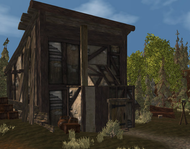
When the player sees this particular house, this is roughly the angle they'll be coming from. They might notice the cylindrical pole up top (put there to obscure holes in the model's roof), the upright pole, and the chopping block and giant logs in the background. These likely become increasingly more noticeable and aim to paint a picture about the house. You'll also note that the house model I picked also looks like it's been cobbled together with beams and boards. The barrels and crates can also support the idea that it's still not quite finished.

One other issue with this house it that it needs to block off access to a more gentle incline that would lead off the edge of the map. In order to fit this need, I extended this concept of the house being worked on, by adding a whole lot more wooden struts, rubble and building clutter behind the house, in a seemingly semi-random fashion. It all should "fit" together, but it can't do so in a tidy way.

Looking behind the house

Here is looks like either the wood is being used to support the house, or that further work still needs to be done. This both augments the visual theme of the house while fulfilling the functional needs of the level. While it's not really realistic for anything else to be built on the end of the house as it is, that suggestion makes the player realise that they can't walk there, so won't attempt to, or if they do, won't be surprised/annoyed when they can't.

Taking another example from the same level of a vegetable garden in front of a house, it was necessary to do a few things to fill in here. Of course, for the most part, it's quite possible to just trample over the garden, unlike the wood mess.

Virtual vegetables

The first step is with the terrain itself, lowering the "garden beds" and texturing them to be dirt instead of grass. This gives the impression that they've been dug out slightly. Putting down the plants was the next step, mixing and matching them to get a spread of crops. While in reality people would likely plant an entire row of plants the same, this kind of mix and match approach is more visually interesting. However, separating each row with wooden planks helps to reinforce a "planned" feel of a real garden, as do the fences on either end. There are also a bunch of tools stacked up against the house wall near the garden, indicating that it's well tended.

The trick here is to ensure that you have an "idea" for what something is going to look like and not be wholly bound but what would be occur in the real world. The trick is to make something look believable and have a feel that fits while still making it look interesting and slightly random or chaotic. A truly regimented appearance is generally not aesthetically pleasing, and should usually only be used if you're trying to create a setting that specifically has that high degree of order.

Wednesday, May 9, 2012

Level Design: One Simple Idea

Level design is both extraordinarily complex and mind numbingly simple. In essence, a level must be aesthetically pleasing and functional for gameplay.  Simply put, it must look good and it must let the player play the game. Unfortunately, that is not a straightforward task. To demonstrate some of my thought processes, here's some of the steps I've taken on a level I'm currently working on.

As I've stated previously, I always try to start with some kind of idea or map sketch. For this level, I started with a map. (Forgive my pictures here, as I've quickly sketched these on the computer because I don't have a scanner) My first idea looked a little like this:

Draft map

This is a simple design, a dual level area, with a stream off to the side. A few extra buildings would added here and there. The main problem is that this just didn't inspire me. Functionally it works, and there is the potential for it to look good, but it lacked "one simple idea". What I mean is the idea of a single view within the level that inspires you, and hopefully the player. You may end up with more than one of these per level, but you should make sure you have at least one of these in your mind before start building the level in an editor.

I attempted to try and rework this idea a few times, but I couldn't manage to get something that really appealed to me. The thing to do in this circumstance is to throw it away. If you have to work really hard to make something feel right, you're better off trying a completely new tack. You may end up returning to this idea at a later date and turning it into something you do like, but you need to be willing to throw away ideas that don't work. So I drew this instead:

Take 2

I came up with this idea after wandering around in some bushland and combining different fragments of the landscape that I'd seen. The four trees in the middle on the edge of the cliff were my "one simple idea", and the view of a tower on the hill in the corner was another. Aesthetically I had more ideas that appealed to me and that I wanted to create. The only real problem I felt was that there could be a bit of backtracking, so I decided to add in a set of steps on the right hand side, which both would prevent that from occurring and also potentially add in another nice visual cue.

I'm part way through developing the level now, so I won't really show much of it, but here's the view that started as the core idea for this level. It doesn't look that great because it's using default lighting and isn't decorated much, but the kernel of the visual appearance I had in mind is there.

One simple idea

The final thing to remember is that fluidity in the design as it translates into an actual level is necessary. My final level will not end up looking exactly like the map as it was originally drawn, but the key visual and functional elements will still stay there. I've already made adjustments in terms of locations and tweaked the structure of the level, but the core layout for movement and the "visual cues" that I want to have present will all be there in the release version of the level.

Monday, February 6, 2012

Level reuse guidelines

I thought I'd go into a bit more detail on the subject of level reuse and cover some rough guidelines on things that work and things that don't. I'll use some examples to compare and contrast different examples where possible - as level reuse has been present in games for quite some time.

Don't reuse plot critical areas
This is Dragon Age 2's main failing. Areas that are home to crucial areas of the plot are locations the player has visited potentially dozens of times before as meaningless and nondescript places  used for sidequests. It ruins any sense of exploration and the sense that something new is occurring, because it's simply reminding the player of the sidequest they did 30 minutes ago... and 30 minutes before that... and 30 minutes before that...  Alternatively, if you consider Mass Effect 1, you'll see that while it potentially featured just as much level reuse as Dragon Age 2, all of the generic levels (with slightly different arrangements of crates) were for side-quests. Optional content that while interesting, wasn't part of the main plot and climatic events of the game. This is why I found the original Halo dull after the halfway point, because the second half of the game was mostly just traveling in reverse of what you'd already done.

Use it as background
Like Sundermount in Dragon Age 2, try to use larger (outdoor) areas as different components. Dragon Age Origins did this with a number of its random encounter areas - several were part of the one "map", but the player could only see a small part of the map at any given section. The additional areas were merely background - area that the player could see and made their current surroundings real, but not accessible to walk. By doing this, none of the effort of level design is wasted (because all of the walkable area is used), but because the different component areas form the vista (partially) visible from the others, each area will feel unique rather than feeling like the same cookie cutter areas. Of course, if it's combined with the above point, then you're even more off the hook.

You saw that wall and mountain in the background from a few different areas

Limit reuse
This might seem like a no-brainer, but it warrants saying. Don't re-use levels too much. If player keep seeing exactly the same terrain over and over again, they're going to get bored. It doesn't matter how pretty it is, they're going to find it tedious. When we're talking a single player experience, especially a narrative based experience, you have to present the player with something new, because otherwise it doesn't feel to them like the surroundings are progressing with the story. Even if the setting is set in the same location over a long period of time, it should undergo cosmetic changes to demonstrate the effect of previous events within the story.

Reuse segments, not everything
Wherever possible, try to avoid reusing an entire level wholesale. If you can fragment a level and potentially present the player with those segments in a different order (or even leaving out bits entirely), then the player will likely see the deception, but is more likely to accept it as a reasonable effort to keep things interesting. Missions within sandbox games (e.g. GTA series) do this brilliant, as do many driving games. They have the player travel through part of a level they've already seen, then introduce new segments that they haven't seen. Designers can also get the player to come through the area from a different angle; have them go backwards through the level instead of fowards. Dragon Age 2 attempted to do this to a degree, but due to failiings in the above areas, it's reuse still grated on players.

This outdoor setting was used in its entirety every time

So there's a few simple pointers in terms of how to manage level reuse in games. Reuse isn't always bad, but if you're reusing levels, make sure that it is a conscious choice and reasoned decision to reuse an area rather than simply "we didn't have the time/budget to do a new level." If you're doing that, then you're game already contains one design flaw that could have been avoided.

Monday, January 30, 2012

Level Design and Dragon Age 2

It's no secret that on the whole I found Dragon Age 2's (DA2) level design to be sorely lacking. From my perspsective, it's one of the areas where it really shows that DA2 was forced out of the door before it truly ready.

The first major flaw is Kirkwall itself. It's a remarkably tidy city by any standards. You barely see any litter in the streets or bits of trash as you wander around. It obviously is home to the most diligent cleaners in the history of Thedas - and probably even puts modern cities to shame in most cases. This is a lack of "trash detail" that pervades much of the game. Places get dirty unless they are cleaned, and this should occur to some degree even in the utopia that is a fantasy world in a computer game. It doesn't need to be brown and mucky everywhere (as would likely be realistic), but there needs to be some mess, otherwise it's simply not believable.

Obviously all mages are forced by the templars to master the "tidy floor" spell

Kirkwall's second problem is the fact that it doesn't change. DA2 takes place over 10 years, yet Kirkwall is almost static in appearance during that time. No new buildings are made, none fall into disrepair, the same tiles are missing in the stone walkways, the same cracks exist in building walls. While it would not be intelligent (or feasible) to redesign the city repeatedly each time a few years advance during the story, the fact that virtually nothing changes is utterly ridiculous. This is particularly the case after the second act, where the city is home to a full-blown conflict in the streets. Yet a few years later when the story resumes, the city has been rebuilt to an identical match of its former state. This is sheer laziness in terms of level design, and does not lend credibility to the narrative at all. Good level design should help tell the story of a location just as much as words should, so to flagrantly disregard this opportunity and to disrespect the storytelling of the game is a hideous shortcoming.

The poor quarter was rebuilt perfectly back the way it was? Seriously?

 The third, and most commented on issue by DA2's critics in terms of level design, is the gross amount of level reuse present within the game. There are a few stock areas that you travel maybe a dozen times in the game, perhaps with different sections blocked off here and there, maybe sometimes in the other direction, but most distinctly copied and pasted wholesale. When part of the critical plot of a game sees you go through and area you've already explored several times before as part of a random cave, the impact of the story and the sense of adventure are all but lost. This is without doubt one of the most telling indictments that DA2 simply wasn't given enough time to be developed. No, level design is not everything, but to come up short in such an obvious fashion that is terribly grating to the player is either a sign of a rushed product, or design staff who simply didn't understand the gravity of the problem for the player. I'd hope it was the former rather than the latter.

However, the news isn't all bad, so I do want to finish with one "good news story" that came out of DA2: Sundermount. This section of the game, or rather, the exterior areas (because the internals are part of the set levels used ad-nauseum) of it, are one of the highlights of the level design. Of course, there's the natural draw of "mountains are pretty", but while Sundermount does succeed aesthetically in providing good visuals, part of this is due to the technical design. Simply put, it reuses existing level design properly - it uses it as backdrop. The foothills of the mountain and the lower parts can all be seen as part of the vista that you can survey as you climb. This is intelligent area reuse, as it not only provides a sense of achievement (because you've climbed those bits before), but also helps to contextualise the player's position and current progress.

If you look carefully, you can even see people walking down below

So the news isn't all bad for Dragon Age 2 on the level design front, but unfortunately it tells us far more about level design through what it does wrong than by what it does right. If there's interest, I might try and put together a few points about when, where and how to reuse levels in a way that's less jarring to players.

Wednesday, May 11, 2011

Once isn't enough

Having come back from my break, I've started modding again for The Shattered War. I decided to get back into the enjoyable task of level design, working on one of the wilderness areas high in the Frostback Mountains. I thought I'd done a moderate amount of work and there'd be some basic sculpting and then it'd be the lengthy process of decoration with props and vegetation.

Taking a break from something and then coming back to it later is a great way to spot the faults in a level. I hadn't realised just how much work that the level needed in terms of additional sculpting to bring it up to an acceptable level. On reflection the level had been done quite some time ago as a basic draft to get the shape of the level and see if the basic concept worked, but somehow along the way I'd decided that it might not have needed too much work. A quick look told me this was most certainly not the case.

It's a bit jagged there

Now, I hadn't touched this level in quite some time, and the draft was done up in a matter of maybe 4-6 hours. However, while the rough shape was done, after some closer examination I realised that the terrain needed to be tesselated to a far greater degree in order to give a proper organic look that I would expect. Now, while there's some degree of sharp and jagged edges that you can "cover up" using props and vegetation, I realised that wasn't an option in this case. If I'm to give a sense of perspective, the narrowest section is about two-to-three people wide, and the low-outcropping is slightly higher than the height of a human. As such, those very angular edges would be extremely up close and personal to anyone walking through that section of the level.

So I undertook a fairly serious resculpting of the level, fixed jagged edges, abrupt angles and anything else that simply looked abnormal. Even now I could probably increase the tesselation another level in large patches of the level, but issues with the lightmapper in the DAO toolset mean that this is likely to cause insightly black spots due to some errors in the way it precalculates lighting effects. There's always a trade-off between effort and aesthetics, so I felt I was able to strike a reasonable middle ground with the reworks I've made thus far. I even managed to get some of the vegetation in for the level, though I've kept it clear from this picture to give a clearer difference shot between before and after.

A less jagged look

It's still not a perfect look by any means, and there's still some softening and adjustment I'd like to do, but overall there's a lot more rounded terrain and less obvious triangles sticking out from the edges of the landscape. A little more effort is still needed here to give more character and variance, even though most players probably won't pay that much attention to this small part of the level. As a side area, this level was unlikely to ever give the player a "wow" moment that would make them gawk at the gorgeous landscape. However, I could not let it pass without still giving the player a sense of the brutal but beautiful landscape of the Frostback Mountains.

Sharp triangles are hard to soften with vegetation, but that area (and the entire level) is now a lot easier to make look like authentic terrain by using a health dose of grass, shrubs and trees. The more interest you can create with the base mesh of a level, the better the level will look once it is fully decorated and populated with everything else that ultimately brings it to life in the game.

Saturday, December 18, 2010

Sharing is Caring

One thing about creating mods for games is that it really heavily relies on the game's player and modder community. Without players, modders would not exist.  It's that simple. Most modders love the creative process of modding, but if there is no player base to experience their content, then the endeavour will ultimately feel flat.

But a modding community also relies heavily on the modders themselves sharing and supporting one another.  By providing support to other people attempting to create content for the game, they often discover possibilities that the designers themselves may not have explored, or workarounds for issues that may or may not have been present in the original workflow of official designers.

Barcode trees. I bet BioWare didn't have to deal with these.

They can also help advertise and support the publicity of other modules - some modding communities have modders attacking or openly criticizing one another, which typically just ends up fracturing the community and resulting in lower quality modules being released. I believe the adage goes: If you hate something, tell the creator, if you love something, tell everyone.

It also allows people to share content to help modders create their own works.  This has been the case with Semper's level pack, which contained several level areas ready for modders to use.  Having previously released my own hillside village for the first Community Contest, which has since been used in the Dirge of Coldhearth module, I'm a strong supporter of helping other modders.  Semper's level pack is a fine example of this, and his village level immediately took my eye as something that I could potentially use for The Shattered War... it meshed beautifully with some ideas I'd already had for one area.

So let's get down to the bit that everyone wants to see... it's screenshot time!

Exploring the modified town

I've done a substantial amount of retooling, modifying structure, appearance and the general layout and accessibility of the level, but still spent far less time than what I would have had to do if I'd made the level from scratch. There's still some additional work to be done, and I haven't really added the population of the town as of yet, but it is definitely a great addition to The Shattered War.

Thursday, November 18, 2010

What has story cost us?

I frequently laud the power of story in video games and how they are an amazing medium for interactive storytelling.  However, there's a flipside to this argument that deserves analysis. What are we losing by having an increased focus on story in video games?  What negative impact is storytelling having on games as a medium for pure fun and entertainment?

Firstly, let's get address that by raising an issue like this, some might argue that I'm calling into question the whole "video games can be art" argument and proving that "video games are just for children/entertainment". But in that case, every "action blockbuster movie" that requires you to check your brain at the door does the same thing for films. Not every book or movie can be considered "art" nor does anything spectacular for their medium as a whole besides pure entertainment. There is nothing to say that an artform can't also purely provide entertainment at times.

Just turn off your brain and enjoy the ride

So with that aside, let's look at how storytelling has modified games. Games now frequently feature a narrative, albeit of greatly varying coherence and quality depending on the particular game. As a result, we also get characterisation and cinematic presentation to help facilitate that story. Good level design dictates that events within a level will help communicate the story and force the player towards their goal.

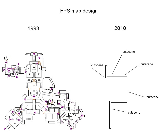
So what do we get when we combine all these factors to make a game? We have to have a plot that makes sense and motivates the player, and we need to amazing set pieces, either gameplay or non-interactive cinematics that progress the game's narrative. And if we're talking AAA titles, everything has to be pretty and the characters probably need voice acting, and our cinematics need good camera work, and the player shouldn't miss any of them, because then they're missing out on content that took lots of time and money to create, and we don't want to waste it because many players will only play the game through once, if that. So when we combine all these things... well, let's compare the map for an old FPS to a new FPS...

So... which one is supposed to be better, again?

I can't take credit for this picture (though I had seen it before pigeon's comment the other day), but it's somewhat brutally accurate. As much as we can applaud Half-Life for the effect it had FPS gaming, its success and critical acclaim have in no small part led to the situation where players are effectively being herded down a narrow corridor that does its best to not look like a narrow corridor. We've been forced to sacrifice freedom for the increasingly cinematic presentation of our gaming experience. Yes, we get incredibly moving and gripping cinematics or scripted sequences that we experience as the player because of this enforced non-linearity, and each of these has more potential impact because there's a steady pacing of narrative to keep the player engrossed and attached to the story. But we're on rails.

Compare this to something like The Bank Job in Thief 2: The Metal Age, where there were about half a dozen different ways just to get inside the building. The player could freely run around the building and thus "experience" the entire level, but they wouldn't necessarily work out all the different ways they could enter the bank. Even this very start of the level, where the player is merely trying to get inside the building helps reinforce the setting, the aim of the level and the character of Garrett as a master thief. He's so good that there isn't just one way into the building, there's several, and he has the ability to pick whichever one he wants!

Is this time spent creating wasted content? I'd argue not, because in providing a wider level, you give the player a real feeling of choice and empowerment, because not only are they choosing how to break into the building, they can visibly identify other ways to get in that present different level of challenge and risk. In the Half-life series, as well created as it may be, as a player you see one way to reach your goal, and you can easily identify that it is the only means to reach your goal.

I can just go in the front door?

I might be starting to sound like a bit of a broken record to regular readers, but I'd like more non-linearity in modern games. In Doom a player could explore side tunnels on most levels, but they'd eventually end up flicking the relevant switch or grabbing one of the three necessary coloured key/skull to get through the relevant door. If we applied that to modern gaming, we could easily have three sections that every player would be guaranteed to experience within the game, but the exact path they used to get there could be slightly different. We do run the risk of creating content that players may not necessarily see (which is an ongoing argument in itself between big-name game designers), but I feel increasingly constrained by being forced down "the one true path" in many modern games.

I imagine some people will stand up and say: "But we have non-linear games! They are sandbox games like Morrowind, Fallout 3 and Red Dead Redemption!" These games definitely have non-linearity, but they introduce this non-linearity by adding a lot of (dead) "transit time" getting from one location to another. I love exploration, but I'm not personally so much a fan when exploration (or traveling) turns into one of the primary mechanics of the game, at least not without a massive variety of landscapes or some other driving force (preferably a narrative force) to push me to explore. Games should "skip the boring bits"... commuting is one of those "boring bits".


Commuting is not fun

Where is the balance between these two extremes? Why does it seem like we've mostly fallen into games/levels with linear paths (albeit with attempts to disguise their linearity) driven by story, or completely non-linear games with very little story to drive us? More importantly, where is the happy medium that allow players choice while still keeping them driven by engrossing narrative? No one appears to have quite nailed this balance yet. It does appear that some developers are attempting to do so on a macro-level, i.e. across the entire game, but the idea of doing it within a level appears to have fallen somewhat out of favour, which I would argue is something of a loss for games when it comes to creating engaging levels.

Wednesday, November 17, 2010

How to improve your levels

Today I'm going to talk about how budding level designers can help improve their level design. If you're not interested in making your own levels, you may not find this terribly useful, but it may cast some light on why the process of level creation is so incredibly time consuming.

Analyse
This part is easy, and your homework for this is to go play some games. Really, it's that simple.  However, you need to be paying attention and you need to look at games from more than just your chosen genre. If you want to learn about how level design can and should support gameplay mechanics, go play some multiplayer-centric first person shooters. Look at maps from Counterstrike, Unreal Tournament 3, or Team Fortress 2. There are some great examples from these three games, but feel free to look at other maps as well. Moreover, consider maps that both work and don't work, and then take the time to decide why. Why do particular maps result in stalemates or levels that are mostly empty apart from one frenetic killzone? If you're not as experienced in level design, make sure you consider the use of height differences in the level, as this is an area that is frequently overlooked and/or misunderstood by beginners. Breaking down level design is an interesting but very complex subject, so for the sake of brevity, I'll leave it as a topic for future discussion.

Plan
Don't fire up your level without putting pen/pencil to paper first. Sketch out your level design! In professional game studios, concept artists create draft images of particular "shots"  that they believe should be the game to help convey the setting or instill players with that "wow!" feeling they get from looking at an amazing level. Even if you can't draw well (and I am terrible at sketching images), you should at the very least have an overhead map of the functional aspects of your level. Where are the trees/buildings/rocks/stairs/etc? You don't have to fill in every detail, but you do need a basic idea of how the level is going to play out.  An overhead map should allow you to concentrate on how the level is going to support and enhance gameplay mechanics, and should help you quickly help identify areas that could annoy the player because of repeated backtracking or a sense of being railroaded.

It doesn't have to be complex. But do it.

Prototyping
Do it. It's that simple. Make up a mock of your level in bare terms as quickly as possibly. There's no need to fill in the space, or even necessarily have the space exactly how you will in the final level. The main idea is to get an idea of level flow, size, and spatial considerations. Ask questions like: Is a hallway too long, too narrow, too straight, or too steep?  Is the level too linear or too non-linear? Does the player have enough space to move around? Can they see or work out where they are supposed to be going?  When doing a prototype, focus entirely on function, not on form. Don't even bother texturing, and only add lighting so you can see what is going on in your level. Make sure the level "works", then start creating in earnest.

I'll make a Dragon Age specific note here and say that you should make sure that you include at least one model in your level before trying to do the process of building lightmaps and using "Post to Local". I had a protoype level without a single mesh model that appeared to cause an infinite loop during the post process.

Playtest
This goes hand in hand with prototyping and revising your levels, but you need to make sure that they are fun. You want your players to have fun, right? Then you should make sure that when you're playing a level you've made, you're having fun. If you're building for a multiplayer game, try and get a few friends to help test as well, even if the levels unfinished. If you can't do that, put in bot-pathing and test if yourself. It's not perfect, but it's better than nothing.


Good multiplayer maps require lots of testing

Throw Away
At some point, you'll end up creating something that doesn't work. It's that simple. Every level designer has done it. Any level designer that claims they haven't, isn't really a good level designer. IT might be a long section where the player feels unnecessarily herded down a linear path, it might be a level where 50% of the mapis never visited by players, or it might just plain suck. Don't get disheartened, but instead realise what is wrong with the design and then ditch it to create your next level. Do not fall into the temptation to try to continually patch up a level whose core design doesn't work. You'll end up with a level that feels like it has been patched up, at least not without likely spending more hours to fix it than it would have done to create a new, better level from scratch.

Budding writers are told that their first few books are always terrible, and they need to get the first few out of the way before they can actually write something good. As a level designer, take that same approach. Prepare to throw away your first few levels, particularly if you're new to level designing or the particular toolset you're using for level creation. On that note, if you're working on a new mod or game, do not start by creating the first area that the player will enter. The first level (or at least one of the first levels) should be very visually appealing to grab the player's attention. Delivering them your first attempts in level creation for the game is not a good means of doing this.

These are a few small tips for improving your level design, but there are plenty more ways to get better. Still, all the theory in the world means nothing if you don't practice. So get stuck into that level editor!

Tuesday, September 21, 2010

News!

In a stroke of good fortune, I was lucky enough to win the first Dragon Age Community contest! This great initiative from a dedicated group of the people from the Dragon Age community is designed to help modders for the game get additional resources to help improve their creations for the game.

My entry was called "Hillside Village" and I showed one screenshot of it in my post yesterday. This level will be present in The Shattered War, though I won't reveal too much about the location itself just yet!

Entrance to the village

A full download of all the levels submitted for the contest can be found here.  There were some really creative entries in this competition, so I must commend the efforts of everyone who entered. I'm actually hoping to update my entry if I'm able to make a few fixes regarding some props not being drawn from a long distance. This is a fairly minor issue, and the level could be used quite happily as is, but if I'm able to address it, then I think it will be worth it.

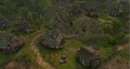
An overheard view of the village

So after working on level design for quite a while now, I've recently returned to doing some writing and creating more dialogue for The Shattered War. After all, there's no use having a pleasant village if it isn't populated! Stay tuned for more updates...

Monday, September 20, 2010

Trees are not barcodes

Yet unfortunately sometimes in DAO they end up looking like them.  There's a strange and inconsistent bug in the toolset that means sometimes trees look terrible from a distance. It appears to be an issue in generating the billboards for different levels of detail. For those that didn't understand that sentence, from a distance, trees are not exactly the same as they are close up (hence they have a reduced level of detail), and are often reduced to being represented by two-dimensional images (sometimes known as billboards). When these billboard images aren't generated correctly for some reason, you can end up with something that looks like the image below.

Trees with barcodes

Some might say "just ignore it" or "it's not that bad", but for anyone who knows me or my modding habits, that's simply not good enough. To have such a blatant error in a level isn't acceptable for me.

Now, with a recent level I was working on (for both The Shattered War and the first DAO community contest), I reached a point where I could not eradicate this problem. No matter how many attempts I made to get the toolset to recreate the billboards, they always ended up corrupted. I wasted hours trying different ways to fix it. However, my stubbornness eventually paid off. I eventually decided to look at what was going on, and found that the process of generating tree information creates two types of files: .spt files (tree locations) and .dds files (texture files).

Loading up an earlier version of the level which had less detail but did not suffer from barcode trees, I used the "Post Trees" mechanism to create the tree information for the level.  I copied the .dds files to a safe directory, and loaded up the latest version of my level. I then used that to recreate the tree information again.  However, once this was done, I was able to copy my saved .dds files from the previous step (specifically the ones containing the billboards) to the relevant directory.  With this done, I started up the game... and voilà! The tree barcodes had disappeared.

People are more fun than trees

While I haven't tested it, I imagine that it's not even necessary to backup your level files at an early stage. This is just a guess, but I imagine it would be possible to create a new empty level and simply add one of each of the vegetation types that you have in your working level. Then generate the tree texture information and copy it to the desired location, simply making sure that the files are named in accordance with the naming scheme of the toolset.

Ideally I wouldn't have to resort to this trick/hack, but it delivered a working level. I'd like to hope that it looks reasonably pretty as well.

Wednesday, August 25, 2010

Small details

Today will be another short post, as I've been spending quite a bit of time doing some polish on previous quests and content.  It's the small things like making sure that a shot looks exactly how you want it, that all the quest entries are laid out nicely and clearly explain the plot and so on that make a big difference in my book. That attention to detail is something that I really feel makes a difference between an engrossing adventure and one that has you cringing at its technical or artistic aspects.

In order to demonstrate the kind of small details I'm talking about, I'm going to show two screenshots of a small area within Fort Velen. The first shot, which is the "bad" or unrefined shot is below. (You may want to open up both images full size so you can compare them properly)

Initial terrain

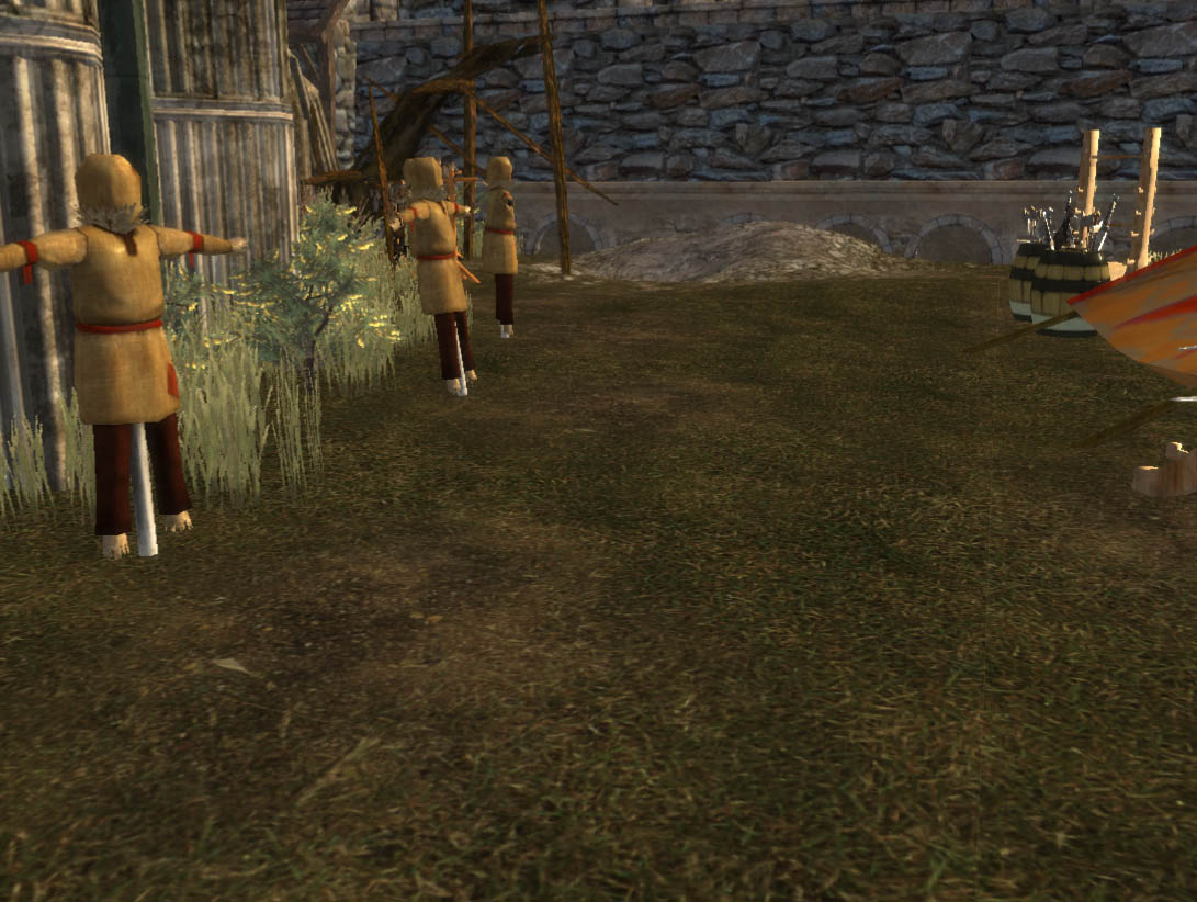
This is a fairly narrow area we're looking at here, so it would potentially be feasible to not pay any attention to it. There are small patches of dirt in front of the training dummies, which are there because people practicing on the dummy would likely wear away the grass in front of it with constant steps. However, I still wasn't happy with it.

"Better" terrain

Now I've added some height variance into the ground, with divots in front of the dummies and small mounds between them. This wouldn't typically be because of the training dummies, but such small bumps would have helped dictate the initial placement of them. The main thing to take away from this is to avoid having sections of uniform terrain.

Flat terrain is unnatural and looks out of place, especially if you're dealing with a natural surface like grass or dirt. Large sections of stone might be flat, but they quickly become monotonous and boring for the player to look out. The same applies to texturing, in that having large swathes of ground covered in exactly the same texture with no interruption looks boring, and usually exposes the tiling of the texture quite clearly.

Now, you might be thinking that the difference between the two shots doesn't look that big, and I agree that it's not, but it will be noticeable. As the player walks along, they'll note their hero going over the small bumps. It will also be more visible because when you're viewing it in game, you'll have proper lighting rather than having everything full lit like you do when you're working in the toolset. (Or at least as I am here) This means that you'll have shadows to further accentuate the height differences.

This might seem like a picky and trivial thing, but trust me, even a small amount of height variation can make all the difference in making a level feel more interesting and more organic. It's a principle applicable to any terrain editing you might do.

Tuesday, August 17, 2010

Don't forget the basics...

After my earlier post, I put what I think are the final touches on the basic layout of the level. So I decided to render lightmaps for the first time and get a basic idea of what the lighting looks like. I then use this to inform my lighting decisions to figure out how many lights I need to place and their intensity. I've started using this approach to Dragon Age because the light-mapper is so finicky. When I'm using the Unreal Engine editor, I'll go crazy with lights and put lots of them in because I know it can and will do the job effectively and efficiently. (Plus that's what the professionals do, so I take my lead from them)

However, since this is only really the third level I've done from scratch in the Dragon Age toolset, and it's been a while since I did the other two, I forgot something basic...

Did somebody turn out the lights?

When you're making a level in Dragon Age, before you render your lightmaps, always put in an Ambient baked light to avoid pitch black shadows.

You don't want to know how long it took for the lighting calculation. Or rather, I don't want to think about it.

Progress

It's been a while since I posted an update on the Shattered War, so I thought I should relate what I've been working on for the past while. Yes, I actually do get some modding done in between these frequent posts!

Now, given I've made a few recent posts about level design, you might have guessed that I've been working on making a level. Well, you'd be right! As such, I have a screenshot for you, but I'll have to get the following disclaimers out of the way first.
  1. The level isn't finished yet (though I've taken the shot so those parts are in the distance).
  2. The shot is taken from the toolset (hence the gridlines).
  3. I haven't done lighting.
  4. I didn't want to put in a bland "full lighting" shot, because they never look that great and detail can be hard to see. (As showcased in yesterday's post of the house)
  5. I photoshopped the brightness/colours of the screenshot because of points 3 and 4.
So keeping that in mind, don't judge the image too harshly. Also, you can click on it for a larger image (~750kb).

Work in progress level

That's all I've got for today, folks.

Sunday, August 15, 2010

Is Perfection Unnecessary?

One of the things that I believe I've confessed before is that I'm somewhat of a perfectionist when it comes to creations. I'll spend a significant amount of time making sure something is "perfect" or at least as perfected as I can possibly make it. When dealing with level design, this means a lot of headaches getting rid of small "errors". However, even when you look at professional games, perfection isn't something that they achieve...

"Our super-wheat can even grow through fences!"

Yes, the wheat is going through those wooden beams in the fence. I'm going to Dragon Age for screenshots, mainly because it's an easy source for me. (As per usual, click for a larger image) While I work in the toolset, I look at existing levels for structure and quality in terms of overall design and artistry, meaning that I spot these "errors". However it's important to note that you could find equivalent errors or issues in games in pretty much any game you care to name.

So keeping that in mind, let's look at Lothering in Dragon Age. Here's something I noticed while zooming around in the toolset:

What kind of architecture is this?

We've got bits of wood randomly protruding from the walls or the tiles of a section of a small coop (the tiled bit) on the roof. That same coop is dug into the thatched roof, and surrounded by a partially levitating fence. However, despite all the strange construction of this house, I'd say it probably doesn't actually matter all that much in the game.

In the toolset, I'm looking at a fully lit model in clear view from any angle that I choose. As soon as we get into the game, the player's view is a lot more constrained. It's limited by the objects in the environment that affect the camera's allowable position, by either being a high-up tactical view or a close in view centred on the character. We don't get free reign to examine our landscape in full when we're in the game. Game and level designers recognise this, and use tricks to make the landscape look more real than it is. Fire up any level editor and look at the extremeties of a level and you'll see that the edges of levels tend to be artificial creations - the painted background of the cinematic set, as it were.

An in-game shot of the same house

When we actually go into the game, those limited camera angles, combined with the fact that we're now dealing with a properly lit model with shadows, mean that it doesn't actually look bad. Sure, upon close examination it looks a little strange at points, but it doesn't look terrible by any standard. (Unless you're even more finicky than I am... but in that case, lighten up!) Moreover, this particular house isn't really "of interest". It's next to the river and there is nothing of interest in the area, meaning most players are just going to walk past and barely give the house a second glance. Most probably won't even walk their character down this way! If it were right in the centre of the town surrounded by quest givers and major NPCs, then it would probably be a different matter. As it is, these small errors are likely to be missed even if a player does like to explore every nook and cranny of a level.

So, this raises this question, how "perfect" do levels need to be? What errors can be left in levels because they are "unimportant" or simply can't/won't be noticed by players? Well, perhaps not something like this...

Floating Ferelden Flora

Again, players might miss this, but a simple backwards glance near the exit of Lothering and you receive the view above. Not to mention that the plains surrounding the trees are... uninspired at best. However, if you remove the floating trees, would this area be an issue? Would people care that the distance is fairly flat and uninteresting?  Well, based on the amount of effort that goes into creating beautiful looking backdrops that are outside of the "playable" area of a level, the answer is a resounding "yes".

So at what point do level designers decide "enough is enough" both in terms of the playable and non-playable areas? Areas that will undergo a lot of scrutiny and repeated viewing obviously require the most attention. Central locations that will be revisited multiple times will have a lot of effort dedicated towards them. Compare the outskirts of Lothering with that of the party camp. A significant amount of effort was invested to make the rocky hills around the campsite look good. A number of the "random encounter" areas actually all belong to one giant level and that is used to export the different walkable aras. As such, there has obviously been time dedicated to its beautification.

But what about those small details? Can we ignore the floating trees in the distance of Lothering? Can we ignore the floating grass in the Korcari Wilds? As a modder, I tend not to be happy when I notice things like that. I'll manually move and rotate shrubs, grass and flowers so they aren't growing into a building or other solid object. But if the professionals are happy to have these errors in, shouldn't modders get away with them too? I'm curious to know other people's opinion on this matter. Where do you draw the line? What do you notice? Are there some types of "errors" that you find more obvious than others?

Tuesday, August 10, 2010

Professionals have problems too

The human and eye and brain are incredibly clever. Subconsciously, they can spot things that aren't right, even if our conscious brain can't work out what the problem is. Computer generated graphics have such difficulty fooling us because the combination of those two is so used to perceiving the real world that even small imperfections in computer generated images destroy the illusion.  Typically, the problem that our brain picks up on is shadows, either them being too bright/dark, the wrong colour given the hue of the light source, or simply not matching the "proper" lighting that would occur from reflected light in the scene. However, sometimes we more consciously pick up on objects looking "wrong" as well.

To demonstrate, here's something that I noticed when I was playing through Dragon Age. I knew something was wrong, but didn't quite know what. To demonstrate the point, here's a screenshot of the offending view in the town of Lothering. Note that it may help if you click for a larger image.

Something is just not right...

Okay, the obvious issue is that lighting issue just to the right of my character. A graphical error, certainly, but not what attracted my attention in the first place. There's another issue too which is hard to see from the shot, but the cobbled path texture extends underneath the barricade. Obviously, a barricade isn't going to be shoved into the ground in the middle of cobblestones. Again, it's another small thing that didn't seem right, but I still figured there was something else.  It wasn't until I looked elsewhere in the level that I realised what my brain had subconsciously registered. It was what was missing that I'd picked up on.

Ah, that's better!

Now, it's not easy to demonstrate what's missing in a shot of the other area, no matter which angle I take a screenshot from.  But if you're thinking about it, you can notice what's been fixed in the screenshot above. I'd suggest opening it up as a larger image again to have a better look. Do you see it?

(How about now?)

The answer? Look at the ground in front of the barricade.  In that first shot, it's totally flat. Perfectly flat ground is something that immediately makes a natural landscape area look less realistic. Even the relatively flat entrance area of the town with the path going through it has a subtle height variation, as the main walkway would be slightly worn down compared to the grass beside it.  Moreover, in this case it, that flat ground doesn't match the scenery/placeables in the level, namely the barricade. There would typically be some sort of support for that type of angled barricade, even if it is just a small mound of raised dirt as is visible in the second image.

I know this might seem finicky, but you'd be surprised what players notice, even if they don't consciously realise they've noticed it. The moral of the story is that even professional level designers have problems in their levels. However, if you analyse them can you dissect what makes them good and what needs improvement. Alternatively, I could be too much of a perfectionist... Until next time, happy level designing!

Saturday, June 12, 2010

Mistakes Equal Learning

Unfortunately it hasn't been a terribly productive day. I'm constantly learning new things about the toolset, which is both good and bad.  This typically results in me making mistakes and taking longer to do something than it should. On the positive side, it does mean that I know the toolset better and in some cases can avoid making the same mistake in the future.

I did a reasonable amount of experimentation with ambient behaviour and animations to work out what could and could not be done. I'll be doing a follow up post covering using animations within ambient behaviour in the next day or so.

The mistake I made was to do with stages and cutscenes.  If you're using a stage for a conversation and then you make a cutscene from a line of dialogue, do not under any circumstance move the stage. Doing so will completely invalidate your cutscene as will no longer map properly to the stage's position the area.  The problem is particularly troublesome because it won't show up if the view the cutscene itself, as the cutscene still has the old stage position data.  The error will only appear in a preview via the conversation or in the game itself.

The other thing was that I went back and did some more touching up on one of my areas. "Why?" I hear you ask. Because I noticed this:


You may (or may not) be able to identify that the grass and shrubberies are floating slightly. I imagine many players might not notice this, but unfortunately (or fortunately, depending upon how you look at it), I do. This means that I had to go through and check the level for floating vegetation, and I also did a double check of the lighting of vegetation, and noted that there were a few issues on shadow boundaries where adjacent plants had greatly varying brightness due to one being in shadow and the other not. This doesn't look good so I had to fix it. Such is my perfectionist streak. I'll know to be mindful of shadowed areas in the future and either not place plants across the boundary, or fix it with a static light.

Finally, regular readers (I'm not sure how many of those I have?) might have noticed the little slideshow widget I've placed into the left pane of the site.  This contains screenshots from various mods and levels that I've produced - I'll be looking to add more eye candy to it as production continues for The Shattered War.

Tuesday, June 1, 2010

The Trouble With Trees

Some minor annoyances occupied too much modding time this evening, time which had already been cut short by seeing the new Prince of Persia movie.  While I could point out a number of weaknesses in the movie, I think it might actually be the first "good" movie based on a computer game.

Anyway, I must thank the very helpful mikemike37 and Kilrogg_ for their advice regarding an issue with tree appearance. Another "post trees to local" and a quick in-game test later, and my trees now look fine within Dragon Age.  They still are occasionally flaky in the toolset, but as long as they're fine in the game itself, I don't care.  Now if only I could fix the minimaps exported by the game so they don't have a horrible dark line along one edge I'd be close to getting rid of all the graphical glitches that are annoying me. (Another is the colour of water in a level, but I think that is due to the water being too reflective)

Aside from that, I was able to do a little bit of plot management, scripting and some short cutscene work. Doing real cutscenes involving camera movement and animation is time consuming - I certainly don't consider myself a director by any standards, and I doubt I will turn into one any time soon. Still, by keeping camera cuts short (even though I often hate that in directing) I can convey information quickly and without hours of effort on my part. My main hope is that it is effective in helping to tell the story and show some action.