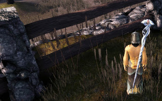
"Our super-wheat can even grow through fences!"
Yes, the wheat is going through those wooden beams in the fence. I'm going to Dragon Age for screenshots, mainly because it's an easy source for me. (As per usual, click for a larger image) While I work in the toolset, I look at existing levels for structure and quality in terms of overall design and artistry, meaning that I spot these "errors". However it's important to note that you could find equivalent errors or issues in games in pretty much any game you care to name.
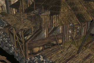
So keeping that in mind, let's look at Lothering in Dragon Age. Here's something I noticed while zooming around in the toolset:
What kind of architecture is this?
We've got bits of wood randomly protruding from the walls or the tiles of a section of a small coop (the tiled bit) on the roof. That same coop is dug into the thatched roof, and surrounded by a partially levitating fence. However, despite all the strange construction of this house, I'd say it probably doesn't actually matter all that much in the game.
In the toolset, I'm looking at a fully lit model in clear view from any angle that I choose. As soon as we get into the game, the player's view is a lot more constrained. It's limited by the objects in the environment that affect the camera's allowable position, by either being a high-up tactical view or a close in view centred on the character. We don't get free reign to examine our landscape in full when we're in the game. Game and level designers recognise this, and use tricks to make the landscape look more real than it is. Fire up any level editor and look at the extremeties of a level and you'll see that the edges of levels tend to be artificial creations - the painted background of the cinematic set, as it were.
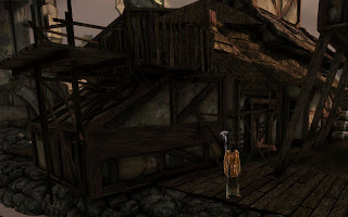
An in-game shot of the same house
When we actually go into the game, those limited camera angles, combined with the fact that we're now dealing with a properly lit model with shadows, mean that it doesn't actually look bad. Sure, upon close examination it looks a little strange at points, but it doesn't look terrible by any standard. (Unless you're even more finicky than I am... but in that case, lighten up!) Moreover, this particular house isn't really "of interest". It's next to the river and there is nothing of interest in the area, meaning most players are just going to walk past and barely give the house a second glance. Most probably won't even walk their character down this way! If it were right in the centre of the town surrounded by quest givers and major NPCs, then it would probably be a different matter. As it is, these small errors are likely to be missed even if a player does like to explore every nook and cranny of a level.
So, this raises this question, how "perfect" do levels need to be? What errors can be left in levels because they are "unimportant" or simply can't/won't be noticed by players? Well, perhaps not something like this...
Floating Ferelden Flora
Again, players might miss this, but a simple backwards glance near the exit of Lothering and you receive the view above. Not to mention that the plains surrounding the trees are... uninspired at best. However, if you remove the floating trees, would this area be an issue? Would people care that the distance is fairly flat and uninteresting? Well, based on the amount of effort that goes into creating beautiful looking backdrops that are outside of the "playable" area of a level, the answer is a resounding "yes".
So at what point do level designers decide "enough is enough" both in terms of the playable and non-playable areas? Areas that will undergo a lot of scrutiny and repeated viewing obviously require the most attention. Central locations that will be revisited multiple times will have a lot of effort dedicated towards them. Compare the outskirts of Lothering with that of the party camp. A significant amount of effort was invested to make the rocky hills around the campsite look good. A number of the "random encounter" areas actually all belong to one giant level and that is used to export the different walkable aras. As such, there has obviously been time dedicated to its beautification.
But what about those small details? Can we ignore the floating trees in the distance of Lothering? Can we ignore the floating grass in the Korcari Wilds? As a modder, I tend not to be happy when I notice things like that. I'll manually move and rotate shrubs, grass and flowers so they aren't growing into a building or other solid object. But if the professionals are happy to have these errors in, shouldn't modders get away with them too? I'm curious to know other people's opinion on this matter. Where do you draw the line? What do you notice? Are there some types of "errors" that you find more obvious than others?


I think these sorts of errors are inevitable given the sheer scale of a project like this and the amount of people working on it. I generally do try to pedantic about these things myself, but I'm sure I miss stuff too.
ReplyDeleteReally, I never noticed stuff like this until I fired up the toolset, so I think that's an acceptable standard.
(Ever take a close look at the waterwheel in Redcliffe? It isn't connected to anything.)
Fix what is simple or glaring and ignore what is a huge time sink.
ReplyDeleteThere are things I am more finicking about in my nwn2 campaign that they were not (such as placing a tree in a vase, where its off center and the trunk is half sharing the same time-space as the vase edge, clearly a design bug) but those are easy, its simply taking pride.
But layering 3 types of dirt in a dark shadow where no one can tell? Wasteful. The 80/20 rule says we spend 80% of our time on 20% of any piece of work, so I cut back on that 20% as much as I can so the majority can be finished quicker.
Incomplete models like the house mean that model is much, much less useful to mod builders. Sure, it's not obvious ingame in the official campaign, but if I wanted to use it in something I was building, I'd be forced to use the same tricks. And I certainly couldn't use an incomplete model for something important.
ReplyDeleteNow I don't know how it is in DA:O as I mod in NWN2 and mostly read this blog for the overall thoughts, but many placeables in NWN2 are missing sides (especially the bottom) or designed to only look good from a single angle. Having proper placeables goes a long way to adding things a modder can do. Even some basic finishing of the sides of a model not expected to be viewable would go a long way for a modder.
I'm not a huge stickler for area design. Stuff like the wheat swaying through a fence would not bother me. I'd say one thing that really bothers me that you brought up here is floating trees, bushes and so forth. That really gets to me for some reason.
ReplyDeleteFor areas I've done for NWN2, I'd say I was pretty involved in it. To the point where I also asked myself, "is this really necessary?" Sometimes, I find the answer is no.
The edges of areas are hugely important though I think. If you design the areas beyond the walkmesh cleverly, you can really add a huge sense of scale and "worldliness" to an area. When I did this I really brought out the bag of tricks, to try and "fool the eye". But it's really important there to place the camera (and playtest it of course) to see where players will and will not be able to look to maintain the illusion. If the tricks are too easily spotted, then the illusion falls apart right away.
I'd suggest the best way to do it is the absolute minimum (which would fit with iterative design practices anyway), playtest it, and fix whatever people notice.
ReplyDeleteThat in itself can be tough for modders/indies without a user testing lab or a good pool of playtesters, but art is really expensive. Even if you're not paying for your own time you don't want to fail to ship because you burned yourself out fixing grass in your first couple of areas.
I'd say beauty/originality is more important then perfection.
ReplyDeleteDragon Age had some good area design but I don't think nwn2 is worth copying. There were many module makers who did better then obsidian. You should copy them if anything. Misery Stone is amazing.
Writing wise obsidian is great though :)
I think the NWN2 main campaign was pretty lacking overall, area design included, but visually speaking (and I'm not speaking about the technical side) I find both MotB and SoZ a lot more beautiful to look at than the DA campaign or what I saw of Awakening.
ReplyDeleteI dont know about that, the redcliff vista was one of the best views I've seen, as well as Ostagar at the top had a much more realistic huge cliff dropping off then nwn2, which cant even tile things veritcally. DA is dark and relatively colourless (and the theme hardly changes from area to area) but visuals wise I was amazed how much more realistic it looked on a game that runs on half the specs nwn2 demands.
ReplyDeleteI can run DA on a 8800GT at max and nwn2 with my 295 GTX is still struggling in cities with not quite max settings. Theres something to be said for being able to put more and more items while consuming less power. It raises the bar of whats possiblea nd the level of realism you can add.
As for Kamals comment, if you can hear me, the DA set doesnt have "full houses". They have pieces. That house wouldn't be in the toolset as a half done house, it would be about two dozen pieces shoved together if what Im told is true.
To confirm the above comment, the houses assets are modular in the sense that they consist of pieces that make up the house. Pieces that can be re-used to create other houses. This is preferable to a full house-model. To modders too.
ReplyDeleteI'd say you should do anything you think you can get away with.
There are conventions that most people accept in games, irregularities such as wheat going through a fence, false shadows et cetera. I think most people can endure a lot of these incidents without it damaging the immersion too much. That floating flora thing is over-stepping it though, that's just too much.
Interesting thoughts, all! Thanks very much for all the comments! I guess I can deem myself too picky in terms of the flora clipping through models, so I'll worry less about that in future. That should save me some time so I can be more careful about making sure none of it is floating - though I'm perhaps even more pedantic about that as it's one of my pet hates... if I notice it.
ReplyDeleteI'm very mindful of implementing tricks to create the illusion of depth that isn't there through clever placement of objects and terrain shaping. Limiting the distance and angle of player vision near area boundaries is also highly useful.
As for graphics in DAO vs NWN2, the latter gets slaughtered in performance because it's doing full dynamic lighting with the day/night cycle rather than pre-baked lighting. Also, turning on vegetation shadows destroys framerates.
Houses in DAO are made up of pieces, and I second that this is great. The variety of shapes and size you can create increases dramatically, even though it's more time consuming to build them, and you have the potential to create floating bits. With great flexibility comes great responsibility... or something like that.
sorry, I didn't mean that nwn2 had bad area design just that the some of the community modules had much better area design.
ReplyDeleteDragon Age lighting is fine when you are playing it but dealing with it in the toolset made me hate it. I loved making dynamic lights during cutscenes in nwn2 and playing with light in general. The DA toolset is just painful for me use.
It sounds like you are on your way to make something good though. Make sure to post big screenshots in this blog.
The small issues in level design could be found throughout the whole DA levels but they are only visible to us modders because gamers can rarely look at the levels from different points of view as you said.
ReplyDeleteOne level i found really strange was the templars' quarters in the circle tower. In "broken circle" it is a tight level with gore in form of bodies and flesh everywhere but when one would want to use that level as a normal area layout where people live and work, most of the space is unusable because it is cordened off by metal fences. There is also one issue that parts of some walls stick out of the level because there would otherwise be a gap between inner and outer walls. I needed to clean that level up for a mod of mine and i am thinking about redesigning it to make it more livable.