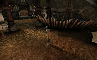
To demonstrate, here's something that I noticed when I was playing through Dragon Age. I knew something was wrong, but didn't quite know what. To demonstrate the point, here's a screenshot of the offending view in the town of Lothering. Note that it may help if you click for a larger image.
Something is just not right...
Okay, the obvious issue is that lighting issue just to the right of my character. A graphical error, certainly, but not what attracted my attention in the first place. There's another issue too which is hard to see from the shot, but the cobbled path texture extends underneath the barricade. Obviously, a barricade isn't going to be shoved into the ground in the middle of cobblestones. Again, it's another small thing that didn't seem right, but I still figured there was something else. It wasn't until I looked elsewhere in the level that I realised what my brain had subconsciously registered. It was what was missing that I'd picked up on.
Ah, that's better!
Now, it's not easy to demonstrate what's missing in a shot of the other area, no matter which angle I take a screenshot from. But if you're thinking about it, you can notice what's been fixed in the screenshot above. I'd suggest opening it up as a larger image again to have a better look. Do you see it?
(How about now?)
The answer? Look at the ground in front of the barricade. In that first shot, it's totally flat. Perfectly flat ground is something that immediately makes a natural landscape area look less realistic. Even the relatively flat entrance area of the town with the path going through it has a subtle height variation, as the main walkway would be slightly worn down compared to the grass beside it. Moreover, in this case it, that flat ground doesn't match the scenery/placeables in the level, namely the barricade. There would typically be some sort of support for that type of angled barricade, even if it is just a small mound of raised dirt as is visible in the second image.
I know this might seem finicky, but you'd be surprised what players notice, even if they don't consciously realise they've noticed it. The moral of the story is that even professional level designers have problems in their levels. However, if you analyse them can you dissect what makes them good and what needs improvement. Alternatively, I could be too much of a perfectionist... Until next time, happy level designing!


After spending a few days in the level editor earlier this year, I started noticing seams and texture wobbles all over the place in Dragon Age (as well as recognising the component parts of everything). Not nearly so many seams as in my own work though :< I salute anyone who can put together a level that holds up to casual inspection, particularly the Bioware artists whose hard work I reuse for my own modules. Art is hard!
ReplyDelete- Mengtzu
Bioware probably has artists whose job is to solely "beautify" the areas the level designers have created. I wish I had an artist gnome to do all that work while I could just have fun designing the levels.
ReplyDelete