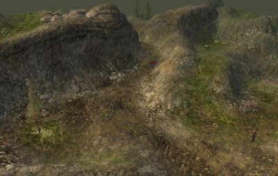
The screenshot that I posted last time was like this:

But I've since reworked this section of the level as a small trial to determine whether the stronger texturing look is better. As such, here is a second comparison shot:

So which do you prefer? And why?


I think the first screenshot is better, it looks more natural. The color of the surrounding stone and cliffs is rather light, and seeing that stone erodes with time the ground (unless it's a marsh, covered with leaves or earth) usually takes a similar color, or is overgrown with plants. The ground on your second screenshot is mostly brown, so I guess it's barren earth. A narrow trail in the landscape that adventurers use would of course be brown, as they would crush any plantlife by walking over them, but on the second screenshot there is too much open ground.
ReplyDeleteI apologize if I'm being overly sensitive or insulting, but I tried to imagine what your landscape would look like in a few months (if it were real) if left alone and I thought that it would quickly be covered with vegetation again.
Sascha: It's not at all insulting, and I really appreciate the feedback. I'm keen to hear people's thoughts and opinions, positive or negative. You've provided a very helpful appraisal on which you preferred and why. Thank you!
ReplyDeleteThe thoughts and opinions voiced by people here will help in forming my design decisions for The Shattered War. After all, mods are ultimately for the players, and thus I want to deliver gameplay, characters and story that they will be interested in, all set in a landscape they will enjoy exploring and looking at.
Hi Amstrad. I prefer the blend-03 screenshot, but agree with Sascha that there is a bit too much brown in it. Perhaps the area occupied by the brown path can be reduced, with a little more grass etc instead? I like how the scenery is more defined in blend-03, whereas blend-04 makes me think that the anti-aliasing has been turned up a little too much :)
ReplyDeleteMind you, take my comments with a grain of salt as I don't actually play RPGs very often ;)
I agree with Ferris GTI. A little more grass and make the brown area more defined (at the moment it's everywhere, up hill and down, so it's hard to get a good read on it).
ReplyDelete