My issues:
1) The scale of objects in the level editor seems off to my eyes. Things look a lot smaller than they actually are. If there's an easy way to get a person sized reference model inside the toolset, I'd love to hear it. The scale isn't horrible for this first level, but I'm mindful that it could be better, and I like correcting problems sooner rather than later.
2) I've still not fully come to grips with lighting. I'm sure there's something I'm missing, but I'm not sure what it is.
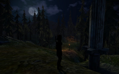
As far as I was aware, I'd done the right things. I've got a light probe in the level, along with three static lights around the level with huge radii with dim color settings that I shamelessly grabbed from the Lake Calenhad level layout. Yet, I've still got the issue that my character is entirely black when in shadow... But the side facing the moonlight is fine.

Maybe I should have taken another screenshot where you can actually see the character lit up by the moonlight to demonstrate the issue, but I'm sure someone has run into this before. I'd love to hear solutions if anyone knows what I'm doing wrong.
And for everyone else... I hope you think this first in-game shot of my very first level looks pretty! So rest assured that you can expect some nice new scenery in The Shattered War!


1. If there's an easy way to get a person sized reference model inside the toolset, I'd love to hear it.
ReplyDeleteFrom the Terrain World, choose Insert->New Test Creature Object.
2. Yet, I've still got the issue that my character is entirely black when in shadow... But the side facing the moonlight is fine.
Sounds like you are missing an ambient light. Add an ambient light anywhere to your level, and given the dark setting for your area, it looks like you will need to choose a really dark color for it, even black. For some reason ambient lights really tend to brighten up the level so the color needs to be made dark, but they're needed to get the shadows right too. Don't worry about the radius or intensity, I don't believe it makes a difference.
Yes, it looks nice. :)
JasonNH
Thanks for the tips and feedback, Jason! Unfortunately, I already have an ambient light in the scene. I've posted on the BioWare social site to see if any lighting gurus have any idea what is going on. Hopefully the answer is a simple one!
ReplyDelete