When you've grown up with something and played it dozens of times over (I played it so much that I hit a bug that prevented warriors from levelling up due to not being able to allocate a weapon specialisation point), there's something about it that means you overlook its many flaws. If I could determine what causes the feeling that keeps you playing a game even though you can see it is somewhat shallow... well, I imagine I'd be selling that secret to gaming companies around the world.
Anyway, I haven't been entirely wasting my time playing Matrix Cubed. I've actually been doing quite a lot of work on an area for The Shattered War. However, looking at it in comparison to BioWare's original levels, I think I've perhaps done a little too much texture blending. What do I mean? Let's do a quick comparison.

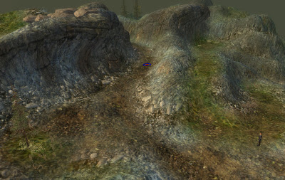
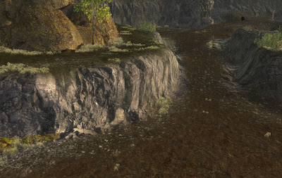
The above screenshot is from a portion of my level. This level is very rocky, and as such I've used quite a number of textures in order to stop it from looking too monotonous. BioWare's level artists are typically very strong in their use of textures, whereas I've done a lot of blending. That's not to say that BioWare's artists don't blend, as they carry out blending very well, but they are willing to use a large section of the same texture at 100% and then blend small patches of a related texture. See the reference screenshot below:

Looking at my level now, I wonder whether I could or should have used less blending. I think the level might have been to boring if I hadn't tried to use that many textures, but at the same time, I realise it is something I may need to keep in check in future. As it is said, less can be more.
I guess I'm curious to hear from people as to which they like more? Do you like the complexity of a landscape with a lot of textures, or do you feel it gets far too cluttered and you'd prefer a more simplified approach to texturing?


I like the screenshot of the one that you did, but I won't blame you if you decide to make it simpler. I believe one of your recent blog posts was about things that people overlook in games... so I suppose it's ultimately up to you.
ReplyDeleteI think they both look great, however I reckon the bottom screenshot looks more realistic. The top one looks to me a bit like a procedurally generated landscape, perhaps because the blending is so smooth? Can you overlay your landscape with some more textures at close to 100% opacity to define areas you want to stand out... ie. sharpen them up a bit?
ReplyDeleteblend-02 is more striking, but I think it serves an important gameplay purpose: show the player where the hell to go. When it's all a wash of blended textures, on some level, it confuses the player. Stronger textures means stronger sight lines and more definiteness in where to go. Visual clutter helps break up the monotony but too much destroys readability.
ReplyDeleteIn blend-01 if it wasn't for the strong valley shape, I'd prefer to walk along the grass than the maybe-dirt because my eye is guided along the green, so my virtual body follows.