Let's talk about what I mean with some examples from the level I've been working on. Again, keep in mind that these are toolset shots of a work in development, so it's not using proper lighting and rendering. Basically what I'm saying is that it'll look better when you see it in The Shattered War.
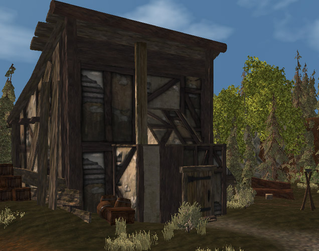
An approach shot
When the player sees this particular house, this is roughly the angle they'll be coming from. They might notice the cylindrical pole up top (put there to obscure holes in the model's roof), the upright pole, and the chopping block and giant logs in the background. These likely become increasingly more noticeable and aim to paint a picture about the house. You'll also note that the house model I picked also looks like it's been cobbled together with beams and boards. The barrels and crates can also support the idea that it's still not quite finished.
One other issue with this house it that it needs to block off access to a more gentle incline that would lead off the edge of the map. In order to fit this need, I extended this concept of the house being worked on, by adding a whole lot more wooden struts, rubble and building clutter behind the house, in a seemingly semi-random fashion. It all should "fit" together, but it can't do so in a tidy way.

Looking behind the house
Here is looks like either the wood is being used to support the house, or that further work still needs to be done. This both augments the visual theme of the house while fulfilling the functional needs of the level. While it's not really realistic for anything else to be built on the end of the house as it is, that suggestion makes the player realise that they can't walk there, so won't attempt to, or if they do, won't be surprised/annoyed when they can't.
Taking another example from the same level of a vegetable garden in front of a house, it was necessary to do a few things to fill in here. Of course, for the most part, it's quite possible to just trample over the garden, unlike the wood mess.

Virtual vegetables
The first step is with the terrain itself, lowering the "garden beds" and texturing them to be dirt instead of grass. This gives the impression that they've been dug out slightly. Putting down the plants was the next step, mixing and matching them to get a spread of crops. While in reality people would likely plant an entire row of plants the same, this kind of mix and match approach is more visually interesting. However, separating each row with wooden planks helps to reinforce a "planned" feel of a real garden, as do the fences on either end. There are also a bunch of tools stacked up against the house wall near the garden, indicating that it's well tended.
The trick here is to ensure that you have an "idea" for what something is going to look like and not be wholly bound but what would be occur in the real world. The trick is to make something look believable and have a feel that fits while still making it look interesting and slightly random or chaotic. A truly regimented appearance is generally not aesthetically pleasing, and should usually only be used if you're trying to create a setting that specifically has that high degree of order.


No comments:
Post a Comment