One thing that is critical when creating interior areas is filling the space. There's nothing worse than wandering around inside a building in a game only to find it consists of little more than a series of bare rooms and corridors. The real trick is that you need to fill that space intelligently. To help you do so, take note of real life.
When you're inside a building, there's typically a purpose for individual space. Have a look as you walk around your house or your work or any other location. Each area has a specific use for its space, and there are objects located within that space matching that purpose. This is what makes can make level design in game interiors so frustrating, in that you have to fill the space with objects that suit the purpose of the room. However, individual objects that would normally fit in a room may not necessarily look right given the context of other objects. What do I mean?
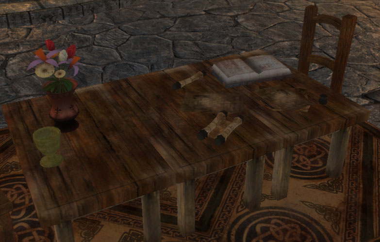
Scrolls, books, parchment... goblet and flowers?
In my placement of objects here in this room, I've matched the room itself, but not the individual items. The right hand side of the table is fine and fits a theme, but the left hand side of the table doesn't match that theme, and doesn't even match itself. What are the flowers doing on the edge of the table? Why are there flowers on a table where someone is doing a lot of reading/writing? What's the goblet for? Actually, why are all the papers arranged as though they're being viewed from the long edge of the table as opposed to the short edge where the chair is located?
Perhaps more importantly, it is possible to use these objects and rearrange so that they don't look out of place. If I turn the papers to face the chair at the end, place the vase in the middle of the table (as it would be if it were there for decoration) and then keep the goblet and the other end, maybe adding a plate and some food... The table suddenly looks a whole lot more like a "real" table as opposed to something with an assortment of props placed on it for decoration. Let's have a look at take two...

Business on the right, pleasure on the left
Of course, some of you might now be calling me silly and saying that players will never notice those decorations. And you might be right. But if the player sees those objects, then subconsciously they're probably going to notice it. The human eye and brain have a remarkable ability to pick up when something isn't "quite right", even it we can't figure out exactly why. The majority of what makes computer generated graphics look "wrong" to us is the fact that the shadows and lighting aren't quite "right". We can't pick exactly what it is that is fake, but we know that it is. The second table, if noticed, is going to give the impression that the area is well used and lived in, as there's both the trappings for working and eating.
That said, I'm not alone in my less than perfect choice of props for interior design. In a bedroom unmodified from BioWare's original design, I came across the following...

I've heard of sleeping with a gun under your pillow, but this is ridiculous...
What does one person (or two if this room is home to a couple) possibly need with that many weapons in their bedroom? Even if someone is a military commander, it seems somewhat excessive to have a small armory of three swords and four bows right beside their bed. And the empty armour stand? Maybe they have one armour for the weekdays and another for their Sunday best?
So there's a great need to fill the space of a level, but in interiors you have to be very careful that you fill the space "properly" and don't make it appear incongruous. You also need to make sure there's sufficient room for the player to move around freely, and also engage in combat if that is going to occur within the area. Exterior levels can get away with open areas a little more freely, as it is possible to decorate with good texturing and vegetation. Exterior areas are also expected to be more organic and have "empty" space; you have to give the player the feeling they're exploring the great outdoors. Of course, balancing empty space and effective level usage is very important and is a general level design consideration, but it might be a topic for another day...
P.S. Yes, I will be continuing the "antagonist" series of posts... I've got a few partially completed but I'm still not quite happy with my descriptions and assessments yet.


Well then, we know what YOU like to do with your drumstick and goblets (in reference to the second screenshot's caption).
ReplyDeleteHaha, classic! I'm not even going to try and respond to that directly.
ReplyDelete